PATTERNS IN JAZZ
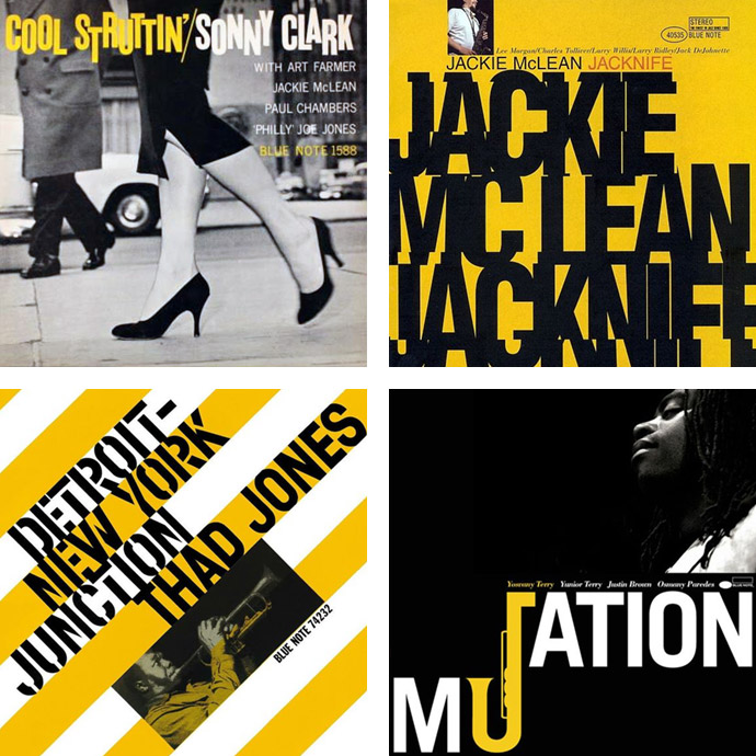
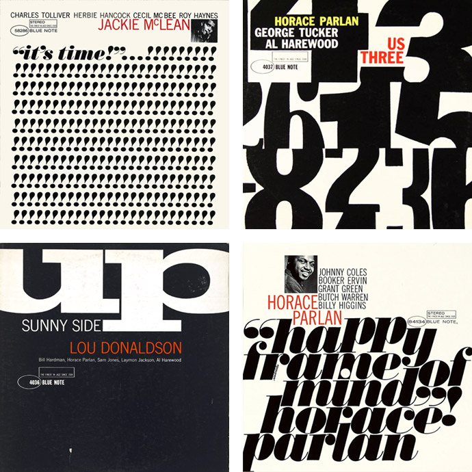
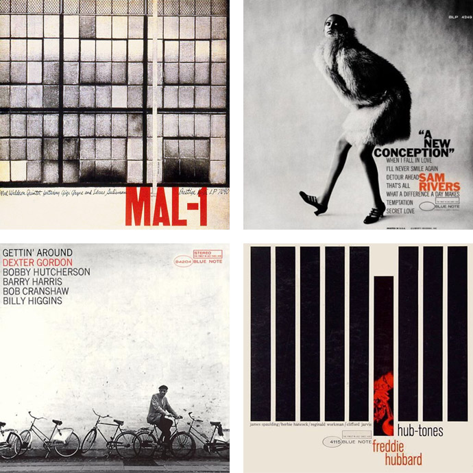
Who knows the American design guru Reid Miles? Miles (1927-1993) is the guy who designed Blue Note in his own, distinctive style but not much has been written about him in the jazz press and if you ask most jazz fans very few will even know his name. Reid Miles is one of the unsung heroes of jazz history but there's absolutely no doubt that the cover art he produced for Blue Note Records in the 50’s and 60’s is an example of iconic graphic design. And Miles' designs still stand today. In the world of graphic design he's often been described as a genius, ahead of his time, and the way he treated the typography as visual elements that can be broken apart and form something new still feels fresh. Miles designed more than 500 jazz sleeves for Blue Note Records and together with photographer Francis Wolff defined the visual branding of the label.
Of course there are well-known designers within my own field who were inspiring for my own development and style. There was for instance Neville Brody in the 80s and David Carson in the 90s to name a few. But the jazz sleeves of the Blue Note Records have always attracted me because of their composition, color and typography. And the more I started listening to jazz, the more I also wanted to know which designers were behind the covers of the albums. Many years ago, I got the book The Cover Art of Blue Note Records and to my great surprise discovered a designer whose name I hadn't heard of until then; let me introduce you to Reid Miles.
Reid Miles was born in Chicago. Shortly before the stock market crash of 1929, his parents divorced and he grew up in California with his mother. His mother went to work in a canning factory to support the family. After graduating, Miles went New York to look for a job. Once in New York, painter, graphic designer, and jazz fan John Hermansader gave Miles his first job as a draftsman at Esquire magazine. However, Reid Miles had a grim personality. The jobs followed each other in quick succession as he was fired almost continuously. Yet he managed to work his way up to art director. In 1951 the famous jazz label, Blue Note Records, began releasing 10-inch long playing records. John Hermansader was one of Blue Note’s first designers, along with Paul Bacon and Gil Melle and, at that moment, Hermansader was also the designer of the record sleeves.
In 1955, Blue Note Records made the move to start issuing records in the 12 Inch long play format. It was in this period the Reid Miles was hired as art director. His main task was to adapt their existing catalog to the new format as well as produce design’s for the new releases. Hermansader and Bacon were the ones who did the groundwork for Blue Note’s design style, which Miles then continued to develop further with his own unique twist. His first set of sleeves for the label included an album by Milt Jackson and The Thelonious Monk Quintet (BLP-1509) and Sidney Bechet’s Jazz Classics Vol 1 (BLP 1201). And Miles went on, designing almost 500 covers during a period of 15 years. It wasn’t until Reid Miles took over as the art director that the jazz label could match the design style with its legendary Blue Note sound. Whether this meant Miles’ creative use of black and white photographs or the way he treated the typography, "Miles made the cover sound like it knew what it lay in store for the listener", Felix Cromey wrote in The Cover Art of Blue Note Records.
"I think typography in the early fifties was in a renaissance period anyway. It happened especially on album covers because they were not so restrictive as advertising." — Reid Miles
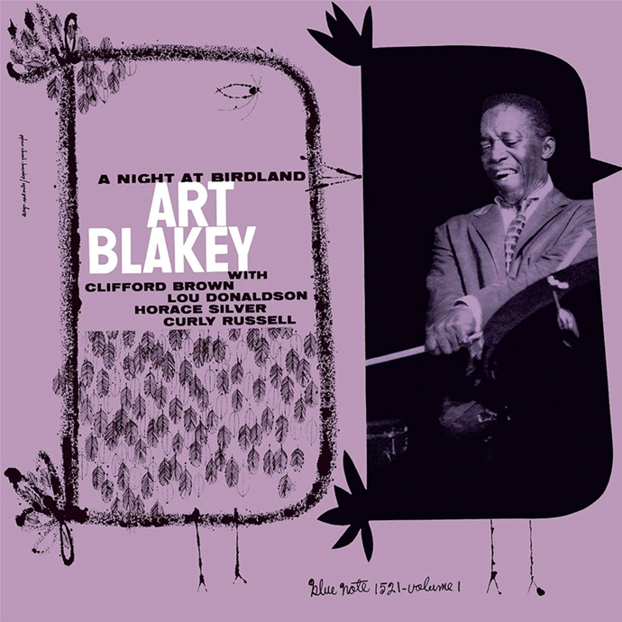
Francis Wolff took the photos in the early days. Reid Miles used the old graphic cutting and pasting technique he learned at Esquire for the first sleeves. But he soon developed an interest in photography. Miles would often take his own shots if he felt he didn’t get what he wanted from Francis Wolff. It wasn't always smooth sailing between Wolff and Miles and Wolff occasionally expressed frustration at the way Miles would crop his work in the design’s. Like Someone In Love by Art Blakey and the Jazz Messengers (B4245), Eric Dolphy’s Out To Lunch (B4163) as well as Herbie Hancock’s Takin’ Off (B4109), are examples of the covers with photographs by Miles. The combination of freedom and structure in the typography would be exploited by Miles at Blue Note for years.
Gradually, however, his work became more graphic again. The retirement of Blue Note co-founder Alfred Lion announced the end of Reid Miles at Blue Note. Lion always kept his hand above Miles' head but once that hand was gone — and after Lion sold the label to Liberty Records — the collaboration with Blue Note ended after 17 years.
When you search the internet for Reid Miles, you will find almost nothing else than his album designs for Blue Note. His staged, advertising photography seems to be forgotten. With his designs for Blue Note he earned about fifty bucks per cover. It makes sense that he took on other work in addition. Through friends he had different and better paid assignments. After leaving Blue Note, he continued working for Look, Eastern Airlines and advertising agencies, among others.
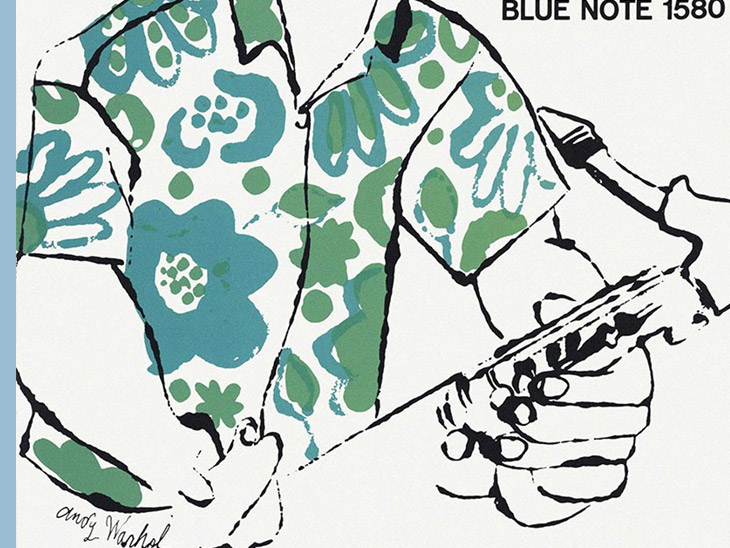
In the fifties, Miles often worked in close collaboration with Andy Warhol, a then-unknown artist, who helped him turn his concept designs to illustrations. One of the most famous results of this joint effort between the two is the cover of The Congregation by Johnny Griffin, which has reached an iconic status in the history of jazz. It was an early example of Warhol’s more flamboyant print-making — that flowered shirt was only the beginning. Reid Miles favoured Warhol’s drawings and the two worked together on a number of albums for Blue Note. Later on Miles’ and Warhol’s relationship even led to him posing nude for one of Andy’s famous portraits.
"If you’re a good photographer you have to be a good storyteller." — Reid Miles
A turning point in his work came when he had to take pictures for Home, the weekend supplement of the Los Angeles Times. Rather than showing people preparing perfect meals, Reid Miles portrayed them in real life, with dirty dishes and a leaking roof. Reid Miles was named the Norman Rockwell of photographers. Literally. Back in the 1970s and 80s Miles made a name for himself creating photographs that conjured up the very distinct, iconic style of artist/illustrator Norman Rockwell. He told the story of products and services through idyllic images composed using a wide-ranging company of characters and a thoughtfully assembled collection of props and sets.
Shortly afterwards, in 1974, he received an assignment from Kawasaki which gave him the opportunity to refine his new style. He wanted to tell a story with his staged photography. The slices of American life seem lifted right off the cover of the old Saturday Evening Post. But the source is not Norman Rockwell; it’s a talented, if mercurial, Hollywood-based photographer named Reid Miles. And while Miles’ blatantly Rockwellian photos are not used to sell magazines, they have been used to peddle almost everything else: for cigarettes (Raleigh and Phillip Morris), motorcycles (Kawasaki), cornflakes (Kellogg’s) and cars (Buick and Chevrolet). "Actually, a lot of what I do isn’t Rockwell at all," said Miles, "just old-time. There’s so little charm in the world today, people are hungry for it."
His work was catching on and he got opportunities to create commercial assignments in his distinctive style. It is a well-kept secret that Miles did not shoot his commercial photographs all at once, in one shot. Extras were photographed separately against a white background. The photos were printed large and retouched. Miles then used his time-honored cutting and pasting technique to compose the final image which he finally photographed again. He directed each photo session as if it were a feature movie. In addition to conventional big brands Miles also shot album covers for musicians such as The Band, Bob Dylan and Chicago.
His customers paid Reid Miles well for his work. For bringing a nostalgic touch to ads, Miles earned $2,500 to $3,000 per layout, making him one of the country’s most successful commercial photographers. Back then, a campaign could easily cost $30,000, excluding extras and props. Miles became famous for being paid $1,000,000 a year to produce Coca-Cola advertising. Quite a contrast to the fifty bucks an album that he was paid by Blue Note. Miles continued working in his Hollywood studio for various clients until a massive coronary in 1993, which lead to his somewhat dramatic death.
As popular as his work was back then, there is very little online. Nobody knows what happened to his archive of work. During the corona crisis, the Dutchman, René van Maarsseveen, found a moving box in his attic with photos of Reid Miles. They were still in the frames, wrapped in old newspapers. The box also contained a sheet of paper with notes about the photographer, he writes on his blog. Feel free to look at what appears to be the latest memorandum of Miles' advertising photography at the bottom of this web page.
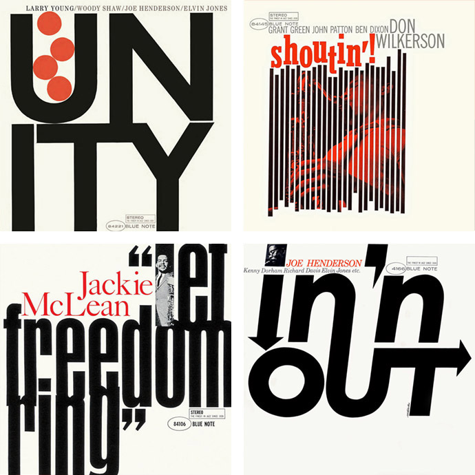
"Reid Miles' designs scream modernism in a way that few can compete against, often treating the typography as visual elements that can be broken apart, stacked upon one another in a playful way, blown up or shrunk down and brought together with the photography in a way that seems gravitational. The layouts are often evasively perfect as they look as if to lay any of them out even slightly differently would be to lay them out wrong." — Alex Charchar, graphic designer and jazz radio host
I'm going to close my talk on Reid Miles with a brief summary of the quintessence of what you should definitely remember. During the fifties, when the design industry was in flux, Reid Miles pushed forward the way the typography is treated with his bold, playful designs, creative use of typefaces, and his distinct preference for contrast and asymmetry.
Personally, I’d like to think, that Reid Miles did the same to modern typography, as Charles and Ray Eames did to modern architecture and furniture and Raymond Loewy to industrial design. It’s clear the Reid Miles' designs captured the feel of the time and helped form a visual representation of jazz that not only defined an era but also a genre. This is quite astounding when you consider that Miles didn’t like jazz at all! He was a classical music guy and as rumour has it gave many of the complementary albums he received away or even traded them in at the record store for classical recordings. "It is interesting to see that a designer who really managed to capture the essence of his time, was also, in a way, disconnected from that very essence … it is perhaps ‘distance’, not engagement that makes the designer." This appeared in an article at the time. There may be truth in that.
Stay amazed!
If you would like more information about Andy Warhol's record sleeves, click here.
You may want to visit the websites of the English type designer Neville Brody or the American graphic designer David Carson, which I mentioned earlier in my introduction.
More story related movies/stories:
Related stories in Woodland Magazine: