TO GRIT OR NOT TO GRID
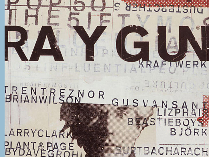
Back in the late 1990s 'Ray Gun' was one of my favourite print publications, due largely to it’s random, scratchy, typography that blended the original Swiss Style with a more personal hand-crafted approach. The man responsible for this hybrid aesthetic, that became known as “Swiss Grit”, was Chris Ashworth. If you've ever seen a copy of 'Ray Gun', the experimental rock-and-roll magazine that ran from 1992-1999, you might recognize the raw grungy aesthetic uniting many of its covers. It was the most eye-catching, explorative and downright irreverent magazine of its time. Chris Ashworth is a British designer and typographer who worked on 15 issues of the publication. A devout adherent to the analog process, Ashworth's hands-on directness created hugely flawed and beautifully imperfect typographic works stands out in an age that emphasizes the cleanliness, control and standardization of digital workflows. Over three decades, he continued to work with paper, ink, tons of tape and Letraset dry-transfer lettering sheets, among many other physical materials. Featuring upside-down pages, illegible interviews, and appearances from Sonic Youth, Björk and David Bowie, the pioneering magazine shook up US publishing. Chris Ashworth therefore became one of the graphic radicals who defined an era.
A few weeks ago I was unpacking the last moving boxes containing a collection of magazines. Doing the cardboard boxes, I found my collection of Ray Gun cult magazines. So I guess it was time to bring back Chris Ashworth's work into the light, as he was art director for the magazine in its glorious years ...
On 'Design is history' I found an enumeration of the most influential things and people in the 80s and 90s of the last century in the field of design. The items mentioned sounded like bells in my ears. Some of these new ideas were developed in a direct revolution against the ideas of the cleanliness, legibility and rationality of modernism: Emigre magazine, David Carson, Neville Brody, the Macintosh computer, Eye magazine, The Face, The Designers Republic and even Ray Gun, amongst many others. I even think they are still very topical and relevant to this day.
Chris Ashworth has traveled much the same path as myself early in his career. I recognize a lot of his style in my older graphic work. Without sounding corny, I want to compare Ashworth to an 'old-school soul mate' as we were both trained in the analog pre-computer era.
As I hardly found a picture of him on the internet, not even his date of birth, and after several days reconstructing his story, I came across a very interesting and captivating videoconference on YouTube, in which designer Chris Do interviewed Chris Ashworth in a videocall of almost an hour. And since I usually write this introduction last, I am currently struggling with the question whether I will post the link or not because if you watch the video, you may find it unnecessary to read my story. Let me think ... I'll post it at the bottom of my story.
Well, this journal is about Chris Ashworth, a British designer who came to Ray Gun as art director in 1997 and gave birth to a new aesthetic he called Swiss Grit — a sharp and contemporary experimental typographic style. What were the origins of his trademark style, his approach to analog design, and how come he's revisiting his personal work after an extended hiatus? A reconstruction.
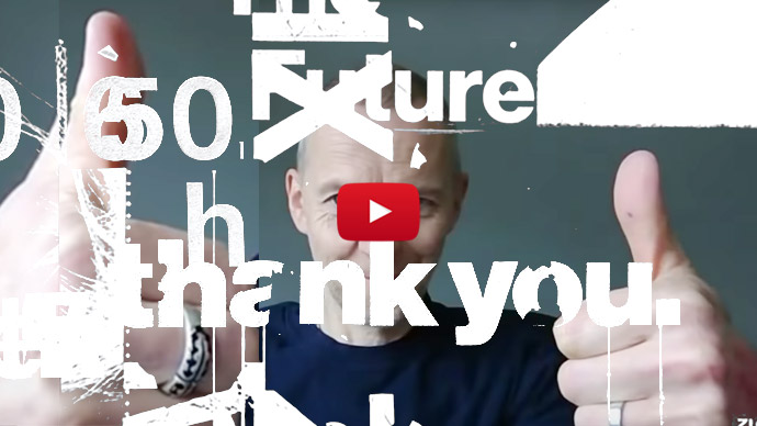
RAY GUN | pushed the boundaries of graphic design in the 1990s
It’s the early nineties, newsagents’ shelves are almost audibly groaning under the paper evidence of media overload. Just then Marvin Scott Jarrett came up with the concept for a magazine that changed the face of American culture. He launched Ray Gun in 1992 out of a tiny, one-bedroomed apartment in Malibu, Los Angeles. Jarrett founded the magazine with the intention of creating a radical, uncompromising publication for kids across America with whom Rolling Stone just didn’t resonate. The magazine’s name was taken from a David Bowie song, Moonage Daydream, “Put your ray gun to my head”.
"Ray Gun didn’t set out to be radical or disrupt anything. We were just doing our own thing, and I think because it was authentic it ended up making a lot of noise, which was fantastic. It resonated with a lot of people around the world." — Marvin Scott Jarrett
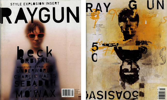
He picked up art director David Carson from a magazine called Beach Culture. Carson tore up the graphic design rulebook and he published interviews that were barely legible on the page, pages were printed back to front and upside down, leaving people wondering whether the move was intentional or not. Carson used scrambled layouts, non-linear narrative and fragmented typography. He designed covers upon which big stars — Beck, Dinosaur Jr., Iggy Pop, Björk — were sometimes upside down or sometimes composed of deconstructed imagery, obscured in shadows or fog, or just… not there.
Interference and erasure were the name of the game, in typical postmodern fashion, pushing the limits of legibility and readability in publication design. They didn’t set out to be radical or disrupt anything, that sort of just happened. Ray Gun quickly became a powerhouse of music and style. It shot down convention during its run, but officially shut down at the tail end of 1999, just seven years after it started. His aesthetic defined the magazine throughout its existence, which was indirectly influenced by postmodern ideas connected to post-structuralism, particularly a school of thought known as deconstruction. Instead of viewing it as an 'ism' (cf. deconstructivism) of the late 80s and early 90s, we see it as part of the ongoing development of design and typography as distinctive modes of representation. Much like the contents inside the magazine, the design and aesthetic approach of Ray Gun was pretty innovative too.
DAVID CARSON | wild layouts that broke all the rules of design
There was an outcry through the design world when the indie music magazine Ray Gun appeared. Some were extremely upset about broken fonts, blurry photos and the illegible confusion of both. Others made art director David Carson the scene's superstar. With wild layouts that broke all the rules of design, Carson wrote design history. One can say it was the crown of his designing profession.
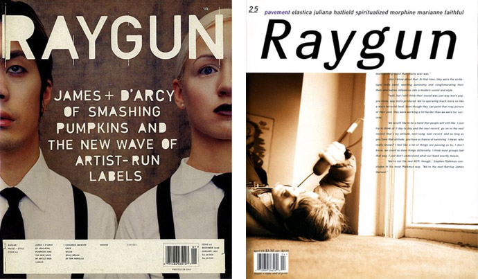
David Carson was an American professional surfer turned DIY graphic designer and is best known for his innovative magazine design and his use of experimental typography way ahead of his time. I didn’t know much about the man, except for his book, when I first met him presenting his work at Citype97, a conference about young urban typography in Antwerp, though I do remember seeing my first copy of Ray Gun and thinking: “Wow… is this magazine handmade?” I’d never seen graphic design like it, it flipped everything you had ever thought about magazine design. Photos covered the whole page and text was placed every which way, some of it was even hidden or off the page. I still remember the cover of issue 25, 1995. I guess it was the first time ever in magazine history that an inside story jumped to continue on the front cover. It was a work of art. Every page could have easily been ripped out and framed for show.
"Designers have become lazy and let computers make too many decisions for them. There’s a renewed interest in being able to tell that there’s a human behind it. Sometimes I feel I’m one of the few voices out there trying to keep graphic design a little more emotional or intuitive or give it some spirit." — David Carson
David Carson served as art director for the first three years of Ray Gun existence, which lasted 7 years and over 74 issues. His art became an extension of the artist he was featuring, and would go far beyond what would be consider normal. While the contents of its pages was not related to graphic design, Ray Gun magazine proved to be an exploration of typography, layout and visual storytelling that would shift the approach of many graphic designers. The magazine itself never had a set logo, it's typeface would change with every issue. This was, and still is, quite an amazing risk to take. Branding is everything, though it wasn't the font that was recognisable, it was the layout.
David Carson is indelibly linked to the notion of the 'end of print', encapsulated by the title of his famous book of that same name. Yet it is perhaps more pertinent to link him to the 'end of reading'. The head-on collision between Carson’s graphic design and the act of reading reached its apotheosis with his notorious Bryan Ferry spread for Ray Gun (1994), which he typsetted entirely in symbol-based font Zapf Dingbats. The story goes that Carson read the interview, deemed it boring, and so rendered it unreadable. No one seemed to mind: did anyone buy Ray Gun for the writing? The fact that he could create a lot of reaction just based on the way he arranged things shows that design is such a powerful language. “But that was largely pre-internet, so there was not a lot of immediate reaction to it — almost none. You might get letters sent in, but there was no testing beforehand, you just did it. I’m sure I chuckled then… as I often do, I thought, ‘Why not? Says who? Let’s try it.’ I’m a bit surprised it became such a big thing. I don’t show it in my talks, and design-wise it’s average, it’s okay—it’s kind of funny and quick. Sometimes you hear a band say they wrote the song they’re best known for in 10 minutes, like a throwaway thing, so it’s a bit like that. But it fit with the attitude of the magazine, and you have a responsibility to the audience to represent them and the subject matter,” David Carson told once in an interview. It was in the spirit of punk rock and roll. Visually it was awesome and, somehow, it worked. Unfortunately I didn't find any mention of how Ferry himself reacted when he saw it.
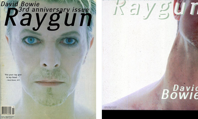
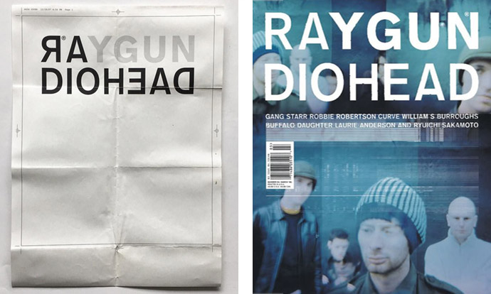
In 1995, it was the first time David Bowie was on the cover. The story behind that 30th issue with David Bowie cover marked the end of the collaboration with Carson. It’s known in a lot of graphic design circles, but basically David Carson sent in the issue with David Bowie’s neck on the cover (see picture above). You didn’t see his face. Obviously, that was sacrilege for Marvin Scott Jarrett. Ray Gun finally got Jarrett's musical hero for a great cover story and Carson turned in a cover like that. Carson insisted on leaving it and Jarrett changed it at the printer. It ended by Jarrett sending Carson a fax saying, “It’s just not working out anymore. I just think we should move on.” So that was the end of the relationship with Carson even though he was extremely instrumental in putting it on the map in design circles. Ray Gun was essentially a music magazine with very cool design. David Carson last edited at Ray Gun in October 1995.
"Only 10,000 people bought the first Velvet Underground record, but each one of those people started a band. So it was in the ’90s with Ray Gun and art directors: every graphic designer I knew at the time was utterly obsessed with the work of the magazine’s founding art director, David Carson, who took font design and distressed type treatments and disintegrated, dystopian layouts to a kind of far-flung devolution." — Brian Eno
CHRIS ASHWORTH | paper doesn't crash
After graduating from the York College of Arts & Technology in 1990 with a degree in graphic design, he saw Beach Culture and Emigre magazine coming out of the States. At the same time, there was a lot of pretty experimental type coming out of London at all the smaller design studios. Design at that point was much more traditional. Ashworth's work was a fusion of the Swiss stuff he was influenced by in college, and all this American stuff, which was much freer and breaking the rules. From ‘91 to ‘97, he was not making any money at all with his designs, but he had lots of typographic fun. Chris Ashworth set up his own studio called Orange, which created black and white, easily photocopiable flyers for local nightclubs and such. Subsequently, he worked for a small independent design studio down the street from The Designers Republic and for MTV Music Awards promo with Anton Corbijn directing of the show.
Before succeeding David Carson as art director of Ray Gun magazine in 1997, a friend from college, Neil Fletcher, set up a graphic research unit called Substance in 1995 named after the Joy Division compilation album, with an aim to pursue exploratary typography in print based design. His creative partnership with Chris Ashworth led to a cover for Creative Review, the UK design magazine. Marvin Jarrett, who ran Ray Gun, got in touch with the editor of Creative Review, Lewis Blackwell, saying he wanted to launch a music magazine in London, and asked if he could recommend any designers. So Blackwell gave Jarrett their names as well as some other studios, and they all started pitching ideas. Chris Ashworth and Neil Fletcher won that pitch. So they ended up doing editorial design for Blah Blah Blah, a partnership magazine that Jarrett had with MTV Europe. With a subheading “The Rebirth of Print” — a crafty sideswipe at Carson’s monograph “The End of Print” — Blah Blah Blah was launched in 1996 as an interesting exercise in guerrilla tactics. “We got the job because we’re fresh,” said Ashworth, the more talkative of the two. Having freelanced at MTV for 18 months, he knew the power structure, could cope with the 'corporate bullshit' and refused to be phased. If you knew Ashworth and Fletcher’s previous work you’d recognise the monochromatic, in-your-face, degraded type as intrinsic to their graphic language and realised they’re not simply conforming to a publishing housestyle. But maybe Jarrett just chose them because he liked that graphic look. A combination of low-tech devices — fax-fucked or scratched out Letraset, blurry images and a gritty obsessiveness with layering and scanned-in textures — meant at first glance Blah Blah Blah looked unreadable. Although there was no grid, the visual anarchy never overpowered the content.
Meanwhile, Ashworth also worked on the Michael Stipe photo-journal about Patti Smith; Two Times Intro: On the Road with Patti Smith, an intimate, diary-like record by Michael Stipe of being on the road with Patti Smith and her band in 1995. The photos in the book feel more like a personal scrapbook than a typical photobook. The book also includes reproductions of Stipe's diary and cut-and-paste experiments with text. The effect is raw and intimate. Being a long-time fan of Patti Smith, I sat down with this book immediately and devoured it from cover to cover. Check it out, especially if you're a fan.
"Each spread is designed to fit the content of that feature. We approached it this way because everything is so stale. People of our age are used to seeing different types of information so they’re not expecting to see everything laid out the same way. Designing a story about The Prodigy, a techno band, is in fact a different brief to an article about Ash, an indie band." — Chris Ashworth explained the schizophrenic aesthetic
Knowing, relating to, and actually being the audience, and being able to design in difference, that was the key. Ashworth and Fletcher extended the role of visual and written information, breaking the rules of magazine layout along the way. There was no orthodoxy, no one style of music or fashion that predominated. In a fragmented social and cultural environment, visually sophisticated consumers were able to recognise what interests them and mix and match to suit their individual tastes. That was the experience of being young in the dying years of the century. Ashworth and Fletcher were attempting to design a magazine which offered that freedom to choose amid total visual mayhem.
They did it for five issues before it went sideways. Although the enthusiasm was there, and the will to succeed, doing it all again and again, under the pressure of a deadline, that’s the crucial test of creativity in magazine design. So, that’s when Ashworth and Fletcher started working on the Ray Gun book. At the end of ‘96, Jarrett asked if Ashworth wanted to move to Los Angeles and do the magazine. It all came by word of mouth. Ashworth always found that’s the best way, letting the work progress naturally.
He and Amanda Sissons (also part of Substance) collectively loved the thrill of deconstruction, the energy in decay. It was the opposite end of the spectrum to Q and Select which then dominated the UK music press. The first few issues they did for Ray Gun were more Blah Blah Blah-y, and then Ashworth got more into this Swiss aesthetic, blended with this gritty, more freeform kind of style. After a few mags, he started to get to a space where he felt like he was doing something fresh and interesting. Chris Ashworth spent eighteen months at Ray Gun creating layouts for fifteen issues.
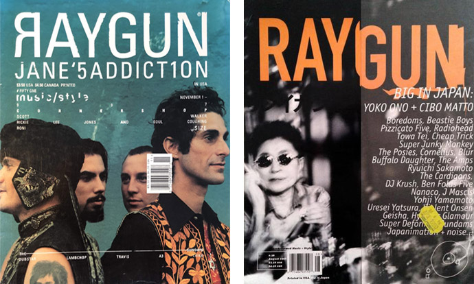
A little did you know. For the August 1996 issue, Yoko Ono and Cibo Matto were on the cover. But it was the back cover. Ray Gun sold the front cover to Levi’s. It was crazy, in publishing terms. Levi’s was thrilled they had the opportunity to buy the front cover. Which probably happens all the time now in more deceptive ways! The big idea at that time was to do the magazine backwards because that’s how Japanese magazines work.
Mistakes were the best things. They didn't happen deliberate yet just random. Ashworth mostly left dry-transfer Letraset characters or transparent films where they landed on the page. In November 1997, he dropped the barcode over the drummer Steve Perkins’ head for the Jane’s Addiction cover. Perkins was really upset. They actually made a huge poster for him without the barcode as some kind of apology.
"I’m trying to do my book and work in InDesign — it’s a nightmare. My designer showed me how. I got a grid, which I drew out on paper, and then we created a grid onscreen. I know the key commands to drop the image in; that’s as far as I’ve gotten. I’m flooding this book with images, and this year, I’m going to start putting the type in. I have to learn how to set type all over again after thirty years. Who knows what it’s going to be like?." — Chris Ashworth
Then after Ray Gun ended in late '99, the English designer had done what he dreamt of doing from a career standpoint and he was at a crossroads. Ashworth chose to stop working by himself and became the executive global creative director for Getty Images (the giant image library) running a creative team, which was something totally alien and new, which he felt was like starting over and super exciting. From that point in 1999, until around 2018 he didn't really do any personal design work outside of his day job. He lost the itch. Currently, the computer layman is working as creative director of the Modern Life & Devices Creative Studio at Microsoft’s Redmond campus headquarters. He runs an in-house creative studio with a team of designers, who occasionally have to show him how some things are done on the computer. He brings in his former experimental design influences, but most of his people haven’t got a clue where his ideas come from. To them, it just looks fresh and exciting and contemporary.
"I guess I've arrived at a place where I believe the thought process and the way that I approach ideas and problem solving is the same in both my professional and personal work, but the way I express those thoughts and ideas are vastly different in terms of visual expression." — Chris Ashworth
SWISS GRIT | a sharp and contemporary experimental typographic style
Chris Ashworth was taught by a Swiss designer between '88 and '90 at York College, so he was well versed in the rigors and principles of Swiss typography and design. Then, in the early 90s, he was exposed to graphic designers such as Wolfgang Weingart, David Carson, Rudy VanderLans and Why Not Associates, amongst others, whose work moved him in the same way the Swiss masters did.
Wolfgang Weingart is regarded as the “enfant terrible” of modern Swiss typography. At an early stage he broke with the established rules. He freed letters from the shackles of the design grid, spaced, underlined or reshaped them and reorganized type-setting. Later he mounted halftone films to form collages, anticipating the digital sampling of the post-modern “New Wave”.
“I guess from that point, I unconsciously started expressing a blend of all of those approaches which ultimately came to fruition in the Ray Gun work — there, you see a lot of negative space, gridded compositions, sans type etc., but it has an organic, handmade touch to it — the grit part”, as Ashworth described his “Swiss grit”. So the term summed up the blend of the two approaches: Swiss typography and design was the bedrock of all great graphic design, but it was soulless. Chris Ashworth tried to bring some soul to it. He saw type as a communication vehicle — both in what words can literally mean and also how they can be used to form other meanings. For example, there was no obvious headline for Ray Gun and the designer often used spacing erratically and not to define words. His style was characterised by hyper detail, barcodes, horizontal lines and the use of multiple transparent layers. The style became a huge hit amongst many.
"I don’t really look at magazine design today. I used to religiously. I don’t know if you’ve seen my Instagram feed, but I get much more excitement and gravitate more to being outside and looking at things, finding things. I used to go through books and magazines and get everything as it came out and soak it all up, but now I’m like admiring weather-worn signs pulling apart from a building. I’ve just gravitated toward it. I get my inspiration from things that I find when I’m just going about walking my dogs. I’m trying to do my own book, so that’s my thing now. I’m up to like, page 950." — Chris Ashworth
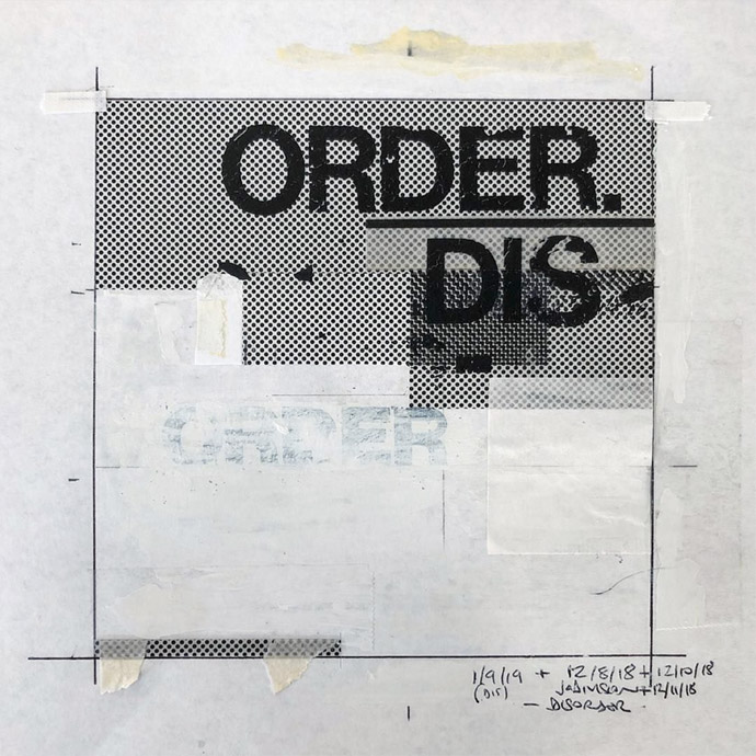
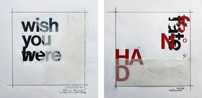
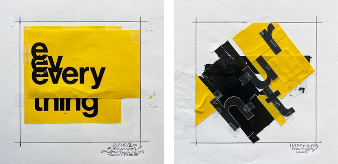
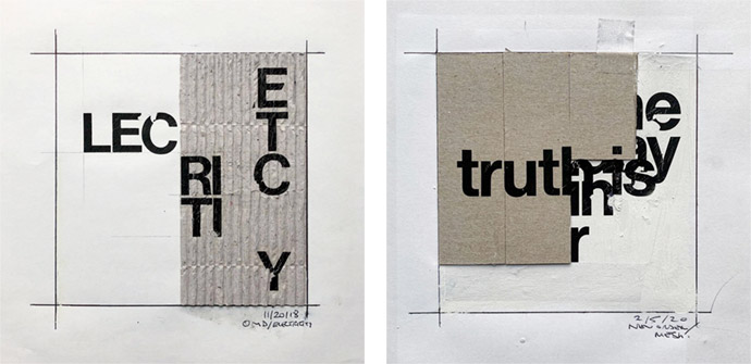
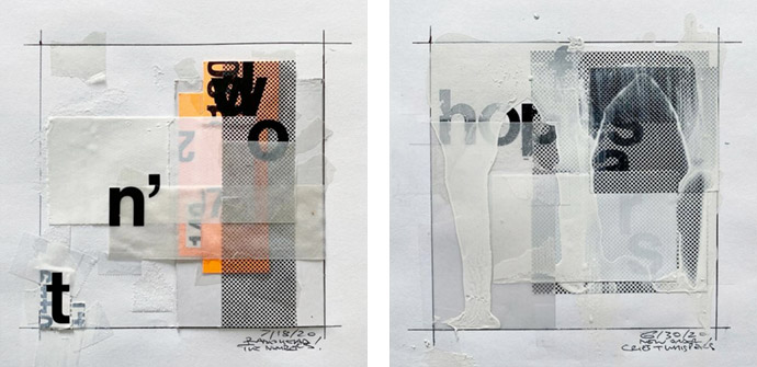
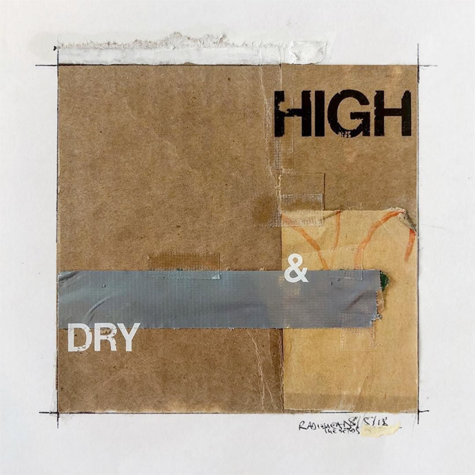
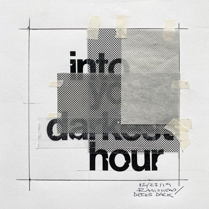
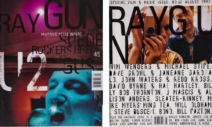
Square-shaped compositions Chris Ashworth posted, and still posts, on his Instagram account @ashworthchris.
Chris Ashworth started doing this thing called ‘From The Archives’ on Instagram, showing all his old work, and then he started messing around with it again, sticking bits of paper together in a very old school way to create new collages. He posted those new compositions without really thinking much about it, and called them ‘Not From The Archive’. Hereby Ashworth likes this idea of showing his past but actually creating some new stuff as well. Is there a book coming up soon? I think so. I hereby place an order immediately.
Ruler, pencil, paper, scalpel, Tippex, tape, tape, tape, Letraset dry transfers, glue. In terms of process, Ashworth starts with a pencil sketch, super crude stuff, but it usually gives him a sense of where he should go. Then he simply starts pulling from what's around him — he keeps a lot of materials close at hand. It seems to me that he also even gives names to his assemblies that refer to a specific song from a music band, or to things he recycled from previously published articles by the relevant artist or band from Ray Gun. For example, I recognize Disorder by Joy Division, Mesh by New Order, Electricity by OMD, Wish you were here by Pink Floyd or Decks Dark and Airbag by Radiohead to name but a few. Great stuff! He recently started a new series of work using an old typewriter to create some poetry-related compositions .
Ashworth started taking photos. Not out of any deliberate decision, but it started as a way to capture his interest and excitement for type again. He's been attracted by imperfections. Then he got a drafting table and started tinkering. He also started sharing some of his personal work again via Instagram @ashworthchris.
"My obsession for type burns deep. I remember going around Europe with my best mate in 1987, and when we returned home after a month he told me that he needed a break from me because 'he was sick of hearing about type' — apparently I'd commented on all the signage and magazines I'd encountered!" — Chris Ashworth
Aside from the design and art direction of the magazine, Ray Gun’s content was relevant and radical, with a mixed brand of music and pop culture infused with street and surfer culture that proved to be a good forecaster for new trends. The proof lies in that Ray Gun found and featured a variety of then-emerging artists who happen to be extremely influential at the moment, including bands such as Nine Inch Nails, Radiohead and Pearl Jam. After 74 issues, the magazine stopped publishing after being rocked by a multitude of financial issues. It’s only fitting that a magazine, that made such a bold statement against the confines of convention, lived a short life, but its influence has proven mammoth.
In 2019, its legacy is celebrated in the form of a new book, Ray Gun: The Bible of Music & Style, which compiles the best covers, fashion shoots, and interviews in one place. It is a bold attempt to tell the story of this short-lived and influential publication. Magazine spreads are laid on the page like canvases, reinforcing the widely held view that Carson was painterly in his approach to graphic design.
Stay amazed!
'Embracing Randomness & Imperfection in Graphic Design & Typography w/ Chris Ashworth' by Chris Do © on YouTube. I edited this one frame from the videoconference. Chris Ashworth will probably know why I just dropped the play button on his face, don't you Chris? If you read my story you'll certainly find the clue.
All images courtesy of the artist.
See/read also some story related movies/interviews:
Related stories on Woodland: