LET'S DEMONSTRATE !
Pierre Bernard (1942-2015) left behind Grapus, one of the most thought-provoking pages in the history of graphic design in France. Grapus was a French communist collective of graphic designers who came together following the student protests in May 1968. Their ambition was to bring about political, social, and cultural change through bold graphic design that was in equal parts provocative and playful. The group’s work was motivated by solidarity with the protesting workers, a critical stance towards capitalism, the goals of the international peace movement, and the belief that art and design can contribute to social change. The collective rejected commercial advertising sphere and mainly worked for the French Communist Party (FCP), the Communist trade union (CGT), for social organizations, communes, cultural institutions, and as of 1981 for governmental ministries as well. They relied heavily on poster art because it enabled them to use the streets to broadcast their message to the public rather than relying on institutions such as museums, schools, or the government. Their designs broke with visual habits and created highly innovative and sensual graphic designs using bright colors, beautiful forms, handwriting, blurred photographs, stains, high-spirited visual pranks and various collage elements, and also very extensive symbolic vocabulary. The technique they used was known as detournement, which is the rerouting of a message through acts of obvious vandalism.
Sometimes at the end of the 90s of the last century, we visited Paris during an excursion of the academy, to which I studied graphic design. On the program, there was a visit to La Villette, Center Pompidou and the graphic collective Grapus. For the first time I had the feeling that I had made the right study choice and that graphic designs would really be something for me. I was impressed by the working method at Grapus and felt the bustling atmosphere. I also liked their choice to design for non-commercial customers.
At the risk of shocking and evoking misunderstanding, let me first of all say that the distinction between “commercial graphics” and “cultural graphics” should in no way affect the graphic value of these two practices that are gaining their strength within one and the same profession. The visual stimuli for cultural and/or commercial exchange between people deserve in all cases to be formalized with quality.
Grapus had a highly distinctive style. For 20 years they provided inspiration to graphic design students all over the world, with their idealistic principles — of brining culture to politics, and politics to culture — and their highly distinctive form of image-making: an accessible and unpredictable mixture of child-like scrawl, bright colors, sensual forms and high-spirited visual pranks.
COMMENT, TU NE CONNAIS PAS GRAPUS ? | Crapules de graphistes!
Paris 1968: The student’s revolt and the protest of the working class shake the foundations of various social spheres. Art and design are equally caught by this new dynamic. The most visible expression of this is the mass-production of posters since the month of May.
The Atelier Populaire des Beaux-Arts broke with the individualistic norms of both art and design practice, suppressing the bourgeois idea of personal authorship. The artist would no longer enjoy a privileged status. In a workshop teeming with activity, several students, paint brushes in hand, might collaborate on a design and posters were printed at great speed, around the clock — photographs by Philippe Vermès, one of the students, show rows of them drying on lines. The students’ well-organized campaign of graphic rebellion, still an unusual event in the history of visual communication, can be seen as a genuinely utopian moment, like the upsurge of political longing that it expressed. Between 15 May and 27 June 1968, the Atelier Populaire des Beaux-Arts created more than 400 designs, while the Atelier des Arts Décoratifs created more than 100. Estimates of the total number of copies put into circulation vary between 300,000 and 600,000. The posters’ recurrent themes include the need for participation, continuing struggle, unity of the workers, strike action and the education of the people, as well as the iniquities of the production line, secret ballots, the “Gaullist cancer” and the media. The posters produced by the Atelier Populaire des Beaux-Arts were weapons in the service of the struggle and were an inseparable part of it. Their rightful place was in the centers of conflict, that is to say, in the streets and on the walls of the factories. To use them for decorative purposes, to display them in bourgeois places of culture or to consider them as objects of aesthetic interest was to impair both their function and their effect. This was why the Atelier Populaire has always refused to put them on sale.
Screen printed posters at the Atelier Populaire, May 1968. | Right: “... a woman in the street, throwing a pavé. It was enticing then because women were seizing control over their bodies, their thinking. Very enticing, even still. In Paris, a few years ago, that poster got the highest price of them all at auction.”
In the mid-1960s, both Bernard and Paris-Clavel discovered Poland, then part of the Soviet bloc. They went there just after Michel Quarez, who made the Polish graphism known in France. The two also studied poster art for a year at the Akademia Sztuk Pieknych in Warsaw with Henryk Tomaszewski. Tomaszewski teached them cultural graphics and the art of the sense of the graphic message. Tomaszewski's work was impressively modern and energetic. His creations, very strong and colorful, fought for the independence of graphics and cultural message, at the time of Stalinism and Polish socialist realism. The Polish master’s posters were notable for a strong emphasis on his own hand as a visible shaping force in the design combined with an extreme economy, an almost aphoristic compression, of form. In a poster for a Henry Moore exhibition (1959) Tomaszewski carved the sculptor’s name from white paper shapes that became sculptural elements in their own right, and treats one as a pedestal for a sculpture. While little of Moore’s work was shown, the graphic construction, most of it comprising empty blue space, still conveyed a sense of the British artist’s formal and spatial concerns.
Pierre Bernard discovered another life there and loved the Polish posters. Poland was really dealing with the difficulty of real socialism. He discovered a hard life, the night that already fell over Warsaw at four o'clock, the cold, no light, nothing in the windows. And then signs everywhere, in all neighborhoods, lit up, with posters about film, theater, poetry, science... However, Bernard painted an embellished picture, but it was real. Tomaszewski was a fantastic teacher. He taught Bernard that designing a poster is about knowing why you make it. Then when you know why, you have to put all your strength into it. His own strength. A poster is the taking possession of a public message by an individual, artist or not an artist, but at least a graphic designer. It is a public object that belongs intimately to him, as it is his creation. It is the individual investment in a collective exchange act.
Bernard returned from Poland in 1966. He became a father and could not find anything that suited him. He worked in an agency for three months on commercials but was bored to death. Society strove for trade to penetrate everywhere. In the context of the 1970s, it was felt that culture was of no use. He was bored for two years and then decided to quit graphic design and go back to school to study animation film. In 1967, Bernard was a student at Arts-Déco. There he met his two friends and future collaborators. With the events of May 68, the three men met in the popular workshops, where the students of Fine Arts and Deco Arts created “visual contests” and produced thousands of posters for the popular struggle every day. These posters were obviously collective creations. They had the strength and determination to make the revolution.
For Pierre Bernard, Gérard Paris-Clavel and François Miehe, the founding members of a collective of graphic designers called Grapus, formed in Paris in 1970, their experiences in the second Atelier Populaire at the École Nationale Supérieure des Arts Décoratifs in May 1968 would be a formative influence. Miehe, a committed communist, had taken a leading role in the graphic workshop and Bernard identified with his dedication to the working class. This fine team has totally reinvented “public utility graphic design” in the space of twenty years, collectively creating thousands of images committed, enraged, funny, powerful, poetic... The group saw life as a field for experimentation, putting the new political, social and cultural debates into graphic form for public discussion. They were joined in the mid-1970s by Jean-Paul Bachollet and Alex Jordan, with Miehe’s departure in 1978, the main core was set.
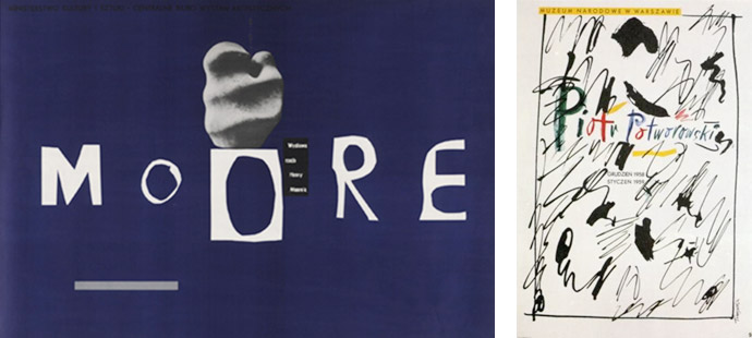
Left: Lithograph by Henryk Tomaszewski, Moore, 1959. Tomaszewski carved the sculptor’s name from white paper shapes that became sculptural elements in their own right, and treats one as a pedestal for a sculpture. While little of Moore’s work was shown, the graphic construction, most of it comprising empty blue space, still conveyed a sense of the British artist’s formal and spatial concerns. | Right: Poster for Piotr Potworowski by Henryk Tomaszewski.
"As a designer I wanted to work for the forces of revolution. My artistic ambition and my vocabulary as a designer, I expected, could come into their own in the service of the party. The vital force of graphic design is political engagement, that is to say the awareness of action in the social field. It has nothing to do with involvement in a political party" — Pierre Bernard
GRAPUS | Stalinist crapule vs. graphic artist
The few French visitors to the Ulm Hochschule für Gestaltung in the 1960s considered it an exemplary place to study. But the prevailing climate in this prestigious German school of design declined irreversibly in 1968. May ’68 challenged its atmosphere of productive collaboration between teachers and students. In France, however, some tried to instill the spirit of this Bauhaus‐affiliated German establishment in art schools because the relationship design-architecture-sociology-psychology-graphic design had never been initiated academically. On the one hand, during the general assemblies and educational commissions of May 1968, these individuals contributed to the creation of a multidisciplinary teaching and research unit led by several members of the Ulm school and supported by the Minister of Culture André Malraux: the Institut de l'Environnement. On the other hand, the student strikes and protests that raged through the Latin Quarter had a strong influence on the Hochschule für Gestaltung, leading to its final closure. Pierre Bernard, Gérard Paris-Clavel and François Miehe found a place where they could continue to explore alternative forms of expression and question submission to the commission. The Institut de l'Environnement, erected a five-story Jean Prouvé building within six months, proposed a new way to make coincide political commitment and graphic creation. It was built in 1968, one of the busiest years of Jean Prouvé's late career. Founded by the Ministry of Cultural Affairs, the building was designed as a space for professionals from multiple disciplines to pursue their work in service to the environment. The building was later occupied by an organisation perhaps more familiar to students of design history: the École Nationale Supérieure des Arts Décoratifs. Grapus was born shortly after, at the Institut de l'Environnement, short-lived attempt to establish a French Bauhaus that opened in 1969.
The meaning behind Grapus's name was described by Bernard that it was functional-sounding, had vulgar overtones, and also had a “whiff of history to it,” referring to French revolutionary Gracchus Babuef. Another interpretation for the creation of the name Grapus, is it was a play on the words crapules staliniennes (Stalinist scum), was both a gesture of political allegiance and a sardonic provocation to potential critics or a contraction of ‘Stalinist Crapule’ and ‘graphic artist’.
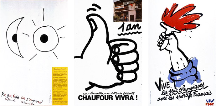
In the 1970s, advertising was king. Pierre Bernard and his friends were committed to counter-current against the “sweet poison of advertising” by proposing posters in areas where the budget was scarce. Bernard felt that graphic communication could be an instrument of change when applied to social institutions. Grapus defended small voices. At the same time, the three friends taught at Arts Déco. They came up against minimalist, strict and straight Swiss graphics, in the service of rules and Queen Advertising. For this Grapus developed sloppy, provocative and funny images, inspired by Polish surrealism, where Mickey Mouse ended up with Hitler's mustache, where Karl Marx raised his thumb like a hitchhiker. An exuberant, direct visual language that opposed both advertising posters and the clever constructions of Swiss graphic design.
Their work focused heavily on posters. One important thing about these posters was that the subjects were new, at least for the French. They were theatrical posters, cinema posters dealing with poetry. These subjects were not being addressed in France because, for the most part, poster-makers were working in advertising, more often than not for products. The posters were a vital part of the struggle shared by students and workers, expressing its key ideas in the most direct public language available, inscribing the streets of Paris with these urgent messages, and attaining a level of visibility and impact on the consciousness of spectators, in some locations, normally achieved only by commercial advertising. Pierre Bernard mixed activism and fun. The avant-garde artist completely surrendered to his work.
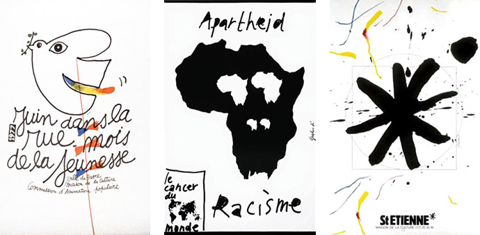
In opposition to this style, and more generally to the pre-established rules, Grapus was committed to serving a cause which was dear to them, with this artistic desire of “gratuitous and impulsive act”, which was opposed to a paid graphics, serving advertising. Art versus graphics. The impulse against the rules. Social causes versus lucrative causes. The style of the collective resided in a united collaboration of the 3 and soon 10 members, intellectuals with childlike traits and a playful aspect. The texts were almost always written by hand, the trembling drawings resembled children's drawings, offering an overall tone that almost denotes and swears with the photography used then in advertising, and of course with the Swiss movement. The artists played with textures, handwritten text, high-spirited visual pranks, bright colors and also very extensive symbolic vocabulary.
"In 1970, when we started teaching, we wanted to talk about everything, because we were carried by this energy of knowledge of images, of construction, of deconstruction. The Swiss don't talk about anything. Jean Widmer, I had him as a teacher, and he was a good teacher. But Widmer, working with him was.... a few moves. Absolute silence and, simply, it took your gaze on the form where it was needed, but without a word. Or such banal words. The subjects were also banal. Advertising. So that was the breaking point between his teaching and us, Grapus. We said: there is not only the product in life, we can talk about theatre, cinema, emotions... And there, at Arts Deco, between the Swiss and us, it was a little tense. With Widmer, we learned a skill, and it was an excellent thing. It's crafts and we don't discuss the rules. While at Grapus, all we enjoyed was discussing the rules to see if they were valid. To see if they were serving a class interest that wasn't ours." — Pierre Bernard in an interview published by Télérama, about the Grapus positioning, the opposite of Swiss graphics.
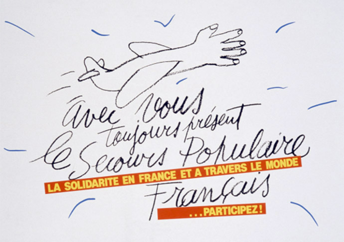
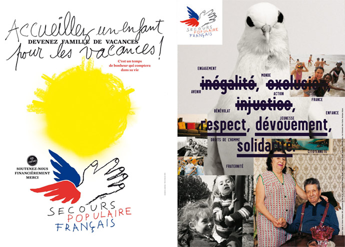
Posters for the Secours Populaire Français: a winged hand stretched out to the sky. The winged hand, the colors blue, white, red, the name written by hand, are part of our collective memory today. The graphic history of Secours Populaire begins in the early 1980s. The association called on the Grapus collective to design a poster representative of its actions. Grapus offered Secours Populaire the drawing of an airplane with the nose of an outstretched hand. This was the first draft of the future logo, which will quickly became the emblem of the association and of solidarity.
Egalitarian and protean group, pugnacious and passionate, Grapus numbered up to twenty people and welcomed, in total, more than eighty creators. It was his strength: everyone shared ideas. Today it is impossible to say who worked on such and such a project. Throughout their history, Grapus remained communists and idealists and continued to operated collectively: all work left the studio signed ‘Grapus’ even when their studio numbers had grown to around 20, operating in three separate collectives.
Because the impact of Grapus goes beyond the borders of only graphics, to reach the visual arts in general. One is struck by the modernity of many works. Mixing handwriting, painting, photography and typography, his production is nevertheless part of a long tradition of popular imagery, born at the end of the 19th century and of which Raymond Savignac (1907-2002) was, after 1945, one of of the best representatives. An assumed parentage. Handwritten texts were one way of opposing the polished aesthetic of advertising. The hand is very present at Grapus. It is found on his posters for the Secours populaire français. This tricolor winged hand, “it is, everywhere in the world, France, the people, generosity”, explains Jean-Paul Bachollet, who joined the collective in 1976. The image took nearly a year before being accepted by the Secours populaire team, as it contrasted with what was usually done for associations. In 1976, Grapus' adventure really began. Until 1977, Grapus devoted themselves mainly to the political image. The cultural sector (Théâtre de la Salamandre, Odéon, festivals in Avignon, La Rochelle, cultural centers in Le Havre, Grenoble, Nanterre) offered a privileged space for their creations where humor and provocation could be expressed freely. And by 1978, Grapus gained exposure in important exhibitions in Paris (Musée de l'Affiche), Amsterdam (Stedelijk Museum) and Montréal (Musée d'Art Contemporain). They were considered in France as the punk/grunge aesthetic among graphic design establishment.
"I did not want to become part of a situation in which one loses one’s freedom of opinion and one’s freedom of power. This means that a trade-union leader or a politician who comes and visits us will be respected, but he will not have any power at all. He will have the power to convince, not to impose." — Pierre Bernard
Grapus' clients didn’t tend to stay with Grapus very long. That's one of the reasons why Grapus had financial problems. Grapus' attitude towards day-to-day life excited clients, but at the same time it made clients took risks. Clients didn’t like to take one risk after another. By the late 1980s, the collective’s productive days were over. In its heyday, it attracted many highly committed graphic artists both from France and abroad. As a collective, the group Grapus received numerous awards and prizes at international poster biennials and triennials. After receiving the NY Art Directors Club Prize in 1987 and the Grand Prix National des Arts Graphiques, the group decided to disband in 1990, as their last illusions collapsed with the fall of the Berlin Wall. “We could either continue as an agency — making a profit but losing our capacity to agitate — or we could separate,” recalls Paris-Clavel. The collective dissolved but the unconventional image language they had created continues to have an effect until today.
Grapus' split was linked to a desire to continue the work method they represented and to attract new people. Their working method was based on 'conflict'. They got into conflict with their clients, but a conflict often arose between the founders, the more everyone could work on and/or discuss other people's projects. The principle of creative conflict was very difficult to maintain in the 1980s. When the older generation quarreled among themselves, the young simply left. It was more the conflict between the bosses than a conflict between creative colleagues. For the younger members of Grapus to play their part fully, they needed complete equality. Thus three new Grapus groups were formed.
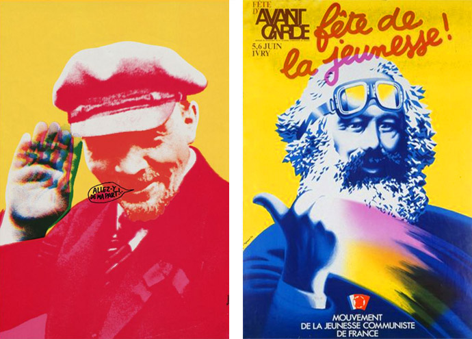
Left: Screen printed poster for an exhibition Grapus at Gallery Saluden-Quimper in Bretagne, 1979. | Right: Advertising poster celebration L'Avant-Garde (newspaper Communist Youth France): Karl Marx hitch-hiking, 1976.
"Even in the successful campaigns, our clients often had a feeling that they had been abused by us. They felt that we rather forced their hands, that we’d expressed ourselves in their place. At some point they agree to the means of expression we use — they claim it as their own since we do the work in their name. Nevertheless they felt a bit frustrated. Perhaps that’s because we didn’t behave like suppliers, slavishly following their instructions. Rather, we were like equal partners, working towards a common goal, which they had decided to share with us by offering us the job. They may have felt slightly dispossessed. We are very aware of it with the passage of time, when we’ve spoken to them again later, or when other people have spoken to them." — Pierre Bernard
The original members of the group have maintained their principles in their work and are practicing their craft, each on their own terms. None have sold out. Pierre Bernard then founded the Atelier de Création Graphique (ACG) with Dirk Behage and Fokke Draaijer. They designed and developed, among other projects, the corporate identity of the Musée du Louvre, with its close-up of a painting evoking a cloud, the visual identity of the La Villette site and the French National Parks and the signage for the Center Pompidou. But the obstacles encountered were constant. For La Villette, the work of Grapus, disappeared entirely before the collective even had time to finish it. Grapus had nevertheless imagined a stretched cow, a brilliant idea recalling the history of the place, once a cattle market and slaughterhouse. The final logo, consisting of three geometric symbols, immediately evoked the functionalism of the Bauhaus. The logo with the three active colors represented the city as a whole, and with the association of black, a particular place. The City of Music was symbolized by a blue circle, the City of Science and Industry by a red square and Parc de la Villette by a green triangle. The great success of the project was therefore due to the flexibility of an ever-changing logo, both unique and multiple.
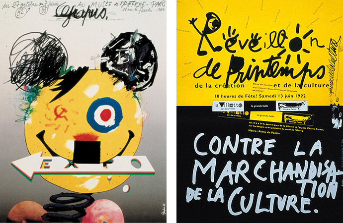
Left: A poster Grapus produced to represent the studio, for a retrospective in Paris in 1982. Their exhibition poster was closer in form and spirit to the anarchic impulses, cultural irreverence and indifference to good taste found in punk graphics of the period. The poster’s only precisely drawn and formal graphic element, the arrow saying “Expo,” is gripped in the grinning figure’s mouth, making it clear that any engagement with design conventions will have to be conducted on Grapus’s own terms. They made their communist sympathies fully evident by placing the Soviet hammer and sickle opposite the French national colors, and turning it into a winking eye. The jocular iconoclasm and slightly threatening demeanor of an image that appears to have sprung into view like a jack-in-the-box is underscored by satirical allusions, within the same ambivalent figure, to the Smiley face, Disney’s Mickey Mouse and Adolf Hitler. In both form and content, this and other posters enact an ideal of social, cultural and personal freedom that would prove to be difficult to sustain as French politics moved to the right in the course of the 1980s. (Grapus 82). | Right: Réveillon de Printemps de la création et de la culture: Contre la marchandisation de la culture, poster for États généraux de la culture, 1992. If you look well you can see the stretched cow in the middle of the poster.
Some theater posters were also refused because Grapus insisted that all actors had their names the same size, without hierarchy, which upsets their agents. The ACG worked in the field of publishing, publicity and signage, as well as in the field of visual identity. Pierre Bernard has been a member of the Alliance Graphique Internationale since 1987, received the Dutch Erasmus Prize in 2006 for his work in the area of design for the public domain. He teached graphic design in Paris at the École Nationale Supérieure des Arts Décoratifs (ENSAD).
Gérard Paris-Clavel pursued the most uncompromising course and joined Vincent Perrottet to start the studio Les Graphistes Associés. Shortly afterwards he left and formed the group Ne Pas Plier, a not-for-profit association (a pun on the “Do Not Fold” warning on mailing envelopes containing graphic material, the name suggests an inflexible state of mind). This studio broke with the traditional view of a graphics studio by refusing corporate work. Alex Jordan founded the studio Nous Travaillons Ensemble (We work together) — another design collective known for it’s social involvement — with Ronit Meirovitz and Anette Lenz, with whom he had worked within Grapus. They wanted to pursue a seamless continuation of the Grapus approach, without being constrained by a paralyzing ideology. another design collective known for it’s social involvement
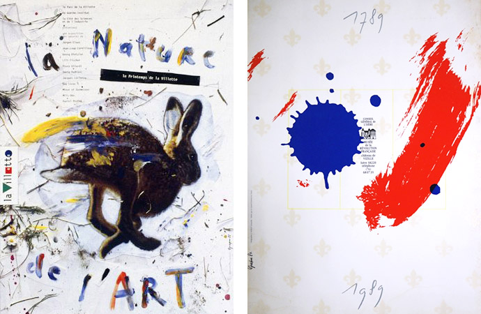
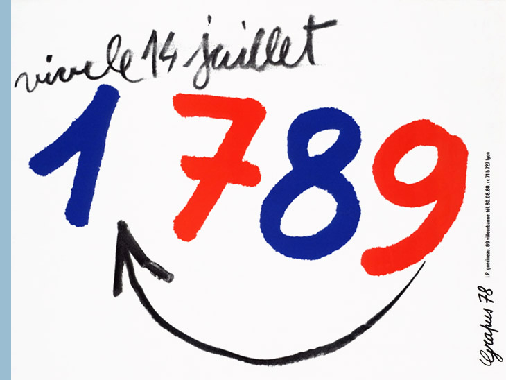
Left: La Nature de l'Art: le Printemps de la Villette, exhibition poster (Grapus 88). | Right: 1789-1989, poster for Musée de la Revolution Française (Grapus 84).
Stay amazed!
All images courtesy of the artist.
More story related movies/interviews:
Related stories on Woodland: