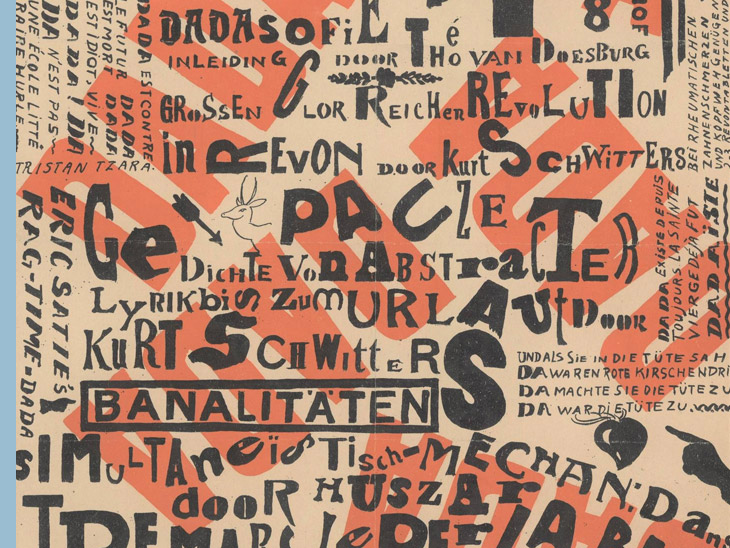
NICHT DADA, SONDERN MERZ
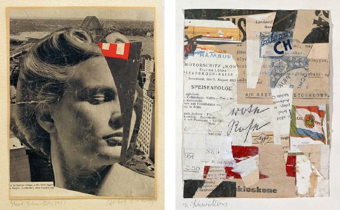
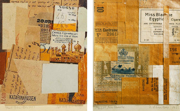
Kurt Schwitters (1887-1948) has long been revered as the maker of poetic, elegiac collages culled from the detritus of post-World War I Germany, and as the publisher of a journal, but his role as a graphic or advertising designer is often overlooked. Kurt Schwitters produced his first abstract collages in 1918, which he called ‘MERZ’, a fragment of the word Kommerzbank. He continued these collages alongside work as a commercial artist, graphic designer and typographer. He used rubbish materials such as labels, tickets, and bits of broken wood in his collages, which paved the way for later movements such as pop art. Beginning in 1924, his one-man MERZ enterprise included the Merz Werbezentrale, or Merz Advertising Agency (later Werbe-Gestaltung Kurt Schwitters), whose clients included Pelikan ink and the city of Hannover. With the same objective of international dialogue that drove the MERZ journal, in 1928 Schwitters founded Der Ring neue Werbegestalter (The Circle of New Advertising Designers), an exhibiting society dedicated to promoting modern graphic design across Europe. Kurt Schwitters was too bourgeois for the Dadaists, too Dada for the burghers. Yet he was the one and only Dadaist. The pioneering German Dadaist was hopelessly misunderstood in his lifetime, at least when it came to the general public. When Schwitters died, he was poor and largely forgotten by the art world. But the rise of assemblage and neo-Dada in the 1950s and '60s brought a renewed interest in earlier forms of radical conceptual innovation.
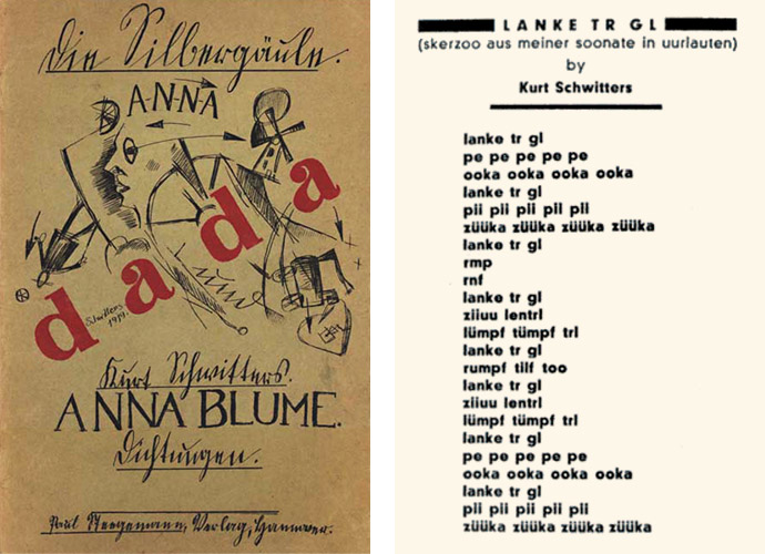
Those who have known me for some time know that I have worked in the past under the pseudonyms Petit Cobra and later Dada Design. No random names. Alongside Cobra, and Pierre Alechinsky, Dadaism is one of my favorite periods in art history. Dada on the one hand as a synonym for hobby horse or often the first word a baby says, but also as an ode to this artist/performer; Überdada Kurt Schwitters. Out of all dada artists I am most inspired by Kurt Schwitters — by his works, but even more by his amazing take on art and life, as he didn’t see a border between them.
Schwitters was a great Dada artist. He is one of the most interesting artists of the 20th century and very productive too. Throughout 61 years of his life he created over 8,000 works, out of which around 2,500 remained till today. Schwitters was a Dadaist in every inch, yet he didn’t get accepted into the Dada club. This rejection didn’t bring Schwitters down or make him turn away from Dadaism though, on the contrary even — it did him good. Thanks to this he established his own, one-man dada movement, and magazine, named ‘MERZ’.
In the early 90s I often travelled to Paris to explore the city on the one hand and to visit major exhibitions on the other. In 1995, I went to the Center Pompidou where a major retrospective was devoted to Kurt Schwitters' work. He was performed there as the forerunner of installation art, the environment and performance, but first and foremost an inveterate romantic.
THE FLEE FROM NAZI GERMANY
Born into a middle-class family in Hanover Germany, in 1887, Kurt Schwitters maintained close connections with his home town throughout his life. He was a son of Eduard Schwitters and Henriette Beckemeyer, who owned a women's clothing store on the Theaterplatz in Hanover, until 1898, after which they lived on income from real estate. He was trained as an artist at the School of Arts and Crafts in Hanover and at Dresden Academy before moving back to Hanover to start his career as a post-impressionist. He was active as a painter from 1907 and then made impressionist paintings. Around 1917 he joined the expressionists. His life, and art, were disrupted by the First World War, which made his work darker and it developed an expressionist tone. The collapse of Germany after the war ended further influenced his artistic output. After the First World War he studied some architecture but unlike most artists of his generation, the war was a traumatic event for him. Feigning a slight mental abnormality, he was employed as a technical draftsman in a steel factory.
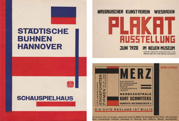
In 1922, Russian avant-garde artist and designer El Lissitzky traveled to Weimar, where he met Kurt Schwitters at a conference for progressive artists. Lissitsky’s fragmented double portrait of Schwitters, made by layering negatives during the photographic printing process, is indicative of the artists’ close collaboration, which lasted until Lissitzky returned to Russia in 1925. El Lissitzky worked closely with Schwitters for the double issue 8/9 of his MERZ magazine. Under the title Nasci (Latin for 'to grow' or 'to be born' and the etymological origin of 'nature'), it appeared in the spring of 1924 as a special issue. Geometric-abstract art and constructivist design were brought together with visual references to nature, in response to the cult of the machine that was emerging. For the cover of this experimental edition, Lissitzky used constructive (typo)graphic elements.
In 1927, at forty years of age, Kurt Schwitters organized a major retrospective of his work, the only one during his lifetime. The Grosse Merzausstellung (Great Merz exhibition) included some one hundred fifty works — paintings and drawings from 1913 up to date of the exhibition — and traveled to venues throughout Germany. The twentieth ussue of MERZ, the self-published journal (1923-32), served as the show's catalogue.
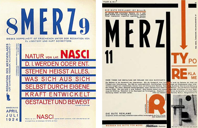
Left: MERZ, № 8/9, designed by El Lissitzky, 1924 | Right: Kurt Schwitters & El Lissitzky MERZ № 11 (Typo Reklame issue), 1924.
"To busy myself with various branches of art was for me an artistic need. It was my desire not to be a specialist in one branch of art, but an artist. My aim is the MERZ composite art work that embraces all branches of art in an artistic unity. MERZ stands for freedom from all fetters, for the sake of artistic creation." — Kurt Schwitters
'FUTURA' WITHOUT A FUTURE
The use of the German typeface ‘Fraktur’ serves to preserve the German identity and must therefore be used at all times. The tone was one of unmistakable emotional nationalism, with little encouragement for the modern-minded designers to express their ideas. In 1929, the Merz advertising agency (Merz Werbezentrale) of Schwitters got the contract to update the town's forms and writing paper. Schwitters had the difficult task of giving a uniform character and distinctive appearance to the diverse offical documents. In an article for the trade journal Papierzeitung, Schwitters stressed that the first step towards uniformity of appearance was to select a suitable typeface.
Commissioning a typographer from the internationally ‘Ring Neue Werbegestalter’ (Circle of New Advertising Designers) marked a significant departure from the traditional use of Fraktur. At Schwitters' suggestion the Town Planning Office agreed on the use of a modern Grotesque typeface. ‘Futura’ was chosen, a geometric sans-serif typeface designed and cut by Paul Renner for the Bauer foundry in Frankfurt-on-Main from 1926 tot 1928. Futura was favoured by many modern typographers because of its clarity. Schwitters praised it highly and was fascinated by its expressive qualities: “clear and exact forms, unadorned, elegant, lively, classically simple, noble, well-proportioned, abstract strength, neutral, great calm of appearance, easy to read, taut, intelligent ...”.
Schwitters' example was picked up everywhere and other city authorities, including the provincial capital of Baden and the housing project Dammerstock in Karlsruhe, have already shown interest as potential clients.
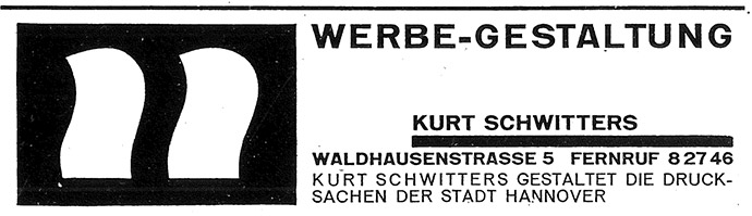
Advertisement for the Merz Advertising Agency with company logo, and the publicity comment: ‘Kurt Schwitters designs the stationary for Hanover Town Council’, 1929 (Schwitters' Work Register no. 51c).
Throughout the 1930s the political situation in Germany became more restrictive. On 14 June 1933 a circular decreed the end of Futura. Headed ‘Use of German Script’ it was almost identical to the edict of 1927: “At a time of rising national spirit great value is once again being placed on our printed matter as an example of German essence. It is not Antique but Gothic lettering (Fraktur) which is most fitting for this pupose.” Schwitters found himself forced to replace the once prized Futura with a traditional black-letter type.
The city felt obliged to fire Schwitters and the Gothic letters were reintroduced. In 1934 Schwitters work was also confiscated from museums. His work was labelled as “degenerate art” by the Nazi government. In 1937 he fled from Nazism to Norway. After the outbreak of World War II, and Germany invaded Norway, he fled from there to England where he spent seventeen months in internment camps, with the longest period spent in Hutchinson camp in the Isle of Man. Upon his release in November 1941 he moved to London. During his years in London, the shift in Schwitters’ work continued towards an organic element using natural forms and muted colours.
It is one of the historical punchlines that the Nazis first misused the Gothic letters or Blackletter scripts for propaganda, so that they could not be used without prejudice for decades before they even got rid of the “German script”. Interestingly, in 1941, the Nazi regime abruptly flipped its position on typography. Adolf Hitler's secretary Martin Bormann wrote the circular — which was not intended for publication — which sealed the end of the ‘Fraktur’ in Germany. If at first, black letter fonts were identified as the true Aryan image, they were suddenly considered a Schwabacher Judenlettern and prohibited its use in official documents. Germans were then told to use only Roman fonts and many later Nazi documents were even printed in Futura.
Shortly afterwards a circular distributed in the Town Council ordered the gradual conversion of office signs to ‘Antiqua’ —, which was proclaimed the German standard type. It was ironic that the stationary, once praised for its use of ‘Futura’ and then changed merely for the sake of ‘German essence’, was once again changed, during wartime. Department names and addresses were set in Antiqua. And so all three variations — Futura, Fraktur, and Antiqua — survived the Third Reich in adminstrative records.
Hitler himself didn't like the Gothic letters. They contradicted his ideal of monumental modernity. His favorite typeface was the Bauhaus-inspired Futura typeface, which was copied on posters for the 1936 Olympic Games. The same applied to recruitment posters in the Netherlands and Denmark. After World War II, Futura was so widely spread internationally that the campaigns against it weren't enough to stop its use. This geometrically constructed, sans serif is still considered a modern typeface that is used in Volkswagen advertising and in Ikea brochures and on which there is even the plaque that was placed on the earth's calling card when the moon landed for the first time.
In post-war western Germany, Fraktur was taboo as a typeface and to this day they still retain a certain connotation. Unfortunately.
"In the war, things were in terrible turmoil. What I had learned at the academy was of no use to me and the useful new ideas were still unready. Everything had broken down and new things had to be made out of the fragments; and this is MERZ. It was like a revolution within me, not as it was, but as it should have been." — Kurt Schwitters
In 1945 Schwitters moved to Ambleside in the Lake District, where he worked on a Merz Barn, one of four started in his lifetime, a modernist cave with walls featuring sculptures and found objects. On 7th January 1948 he heard that he had been granted British Citizenship. He died the next day of heart failure and was reburied in Hanover. Polish futurist Stefan Themerson, and close friend of Schwitters, wrote of Schwitters' international orientation: “You can perhaps be an Italian futurist, or a Russian futurist; a French cubist, or a Belgian Congo cubist; a German expressionist, or a Japanese expressionist; but you cannot possibly be an Italian, or French, or German dadaist. You are either a dadaist or a German, etc. etc. You cannot be both.”
After Schwitters' death, a friend, the sculptor Naum Gabo, recalled that Schwitters would stop suddenly in the midst of conversation, looking intently at the ground: “Then he would pick up something which would turn out to be an old scrap of paper...He would carefully and lovingly clean it up and then triumphantly show it to you. Only then would one realize what an exquisite piece of color was contained in the ragged scrap. It needs a poet like Schwitters to show us that unobserved elements of beauty are strewn and spread all around us and we can find them everywhere... if only we care to look, to choose and to fit them into a comely order.”
DADA IS MERZ, MERZ IS DADA
Kurt Schwitters was one of the most engaging mavericks of the art of the 20th century. His art is invariably grouped with DADA, although personal clashes prevented him from being admitted formally to membership, and by nature he would never be fully committed to any collective movement, even one of protest: his lack of interest in politics set him apart from the main group of German Dadaists, as did his residence in Hanover rather than Berlin. Yet paradoxically Schwitters was intrinsically a Dada: the French Dada poet Tristan Tzara wrote that Schwitters was “one of those personalities whose inner structure was always Dada by nature. He would still have been Dada even if the Dada call had not been sounded.”
The Dadaists were a loose collection of artists united only but by their anti-bourgeois, anti-naturalistic tendencies. Their main differences were artistic rather than political. The Dadaists wanted to get rid of art. They made anti-art. Schwitters was not an iconoclast, but an esteet and a constructivist.
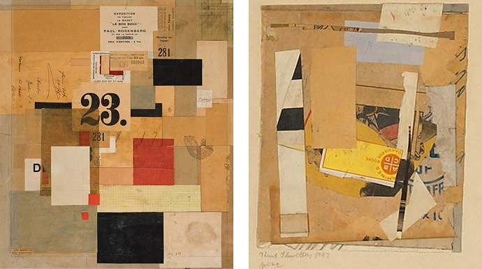
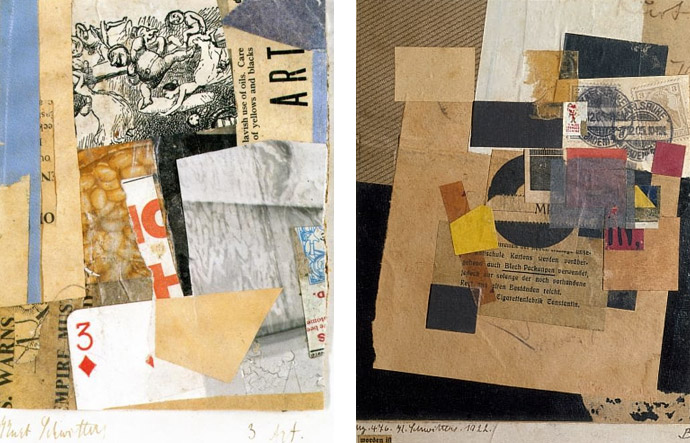
In 1919 at the age of 31, Schwitters formed MERZ, a one-man movement in response to Dada, best known for his collages. In addition to newspaper clippings, he used materials such as paper, cardboard, the debris of the commercial world, such as ticket stubs, advertisements, chicken wire and barbed wire, which he simply found on the street, to construct fanciful assemblages of shapes, colors, and juxtaposed meanings. For this reason, he quickly became a local celebrity in Hanover, as one Friedhelm Lach wrote: “Man empfahl ihm, entweder den Irrenarzt aufzusuchen, oder man sah lächelnd über den Aussenseiter hinweg, der — man stelle sich das vor! — mit seinem Fahrrad durch die Straszen Hannovers fuhr und Papierfetzen, Korken und Holzstücken sammelte.”
LIKE DADA, MERZ WAS A NONSENSICAL WORD
The Dadaists had taken it from the dictionary, Schwitters from reality. Schwitters’ MERZ came into existence by chance. MERZ came from an advertisement by the KOMMERZ UND PRIVATBANK, on which only the letters MERZ could be read. He used this for his first remarkable collage in 1918, which he named Das Merzbild. From then on everything became MERZ: Merzbilder (his collages), Merzplastik (his assemblages), but also Merzpoesie, Mersbühne, Merzbau ... Schwitters was a thoroughly conceptual artist: his goals were synthetic, and specifically intended to violate disciplinary boundaries. In 1924 he founded his advertising agency, the Merz Werbezentrale.
Schwitters had discovered that he was not at heart a painter, but that for him the essence of art lay in the combination of existing materials. In 1919 the first exhibition of his Merzbilder took place in the gallery Der Sturm by Herwarth Walden and in 1920 his work was exhibited at the Société Anonyme in New York. In the fall of 1921, Schwitters organized a dada tour to Prague with Raoul Hausmann, among others. During this tour he became acquainted with Hausmann's sound poem ‘fmsbwtcu’ and was so enthusiastic about it that he would often recite it afterwards as ‘portrait of raoul hausmann’. It also served as an example for his Ursonate, on which he worked until 1932.
The MERZ concept was explained by Schwitters in the first issue of Der Zweemann: Monatsblätter für Dichtung und Kunst: “MERZ-paintings are abstract artworks. The word ‘MERZ’ refers, essentially, to the embrace of all conceivable materials for artistic purposes and, technically, to the equal evaluation [Wertung] of individual materials as a matter of principle. So Merzbild avails itself not only of paint and canvas, brush and palette, but of all materials visible to the eye and of all necessary tools. It is irrelevant whether the materi-als used for Merzbild were once made for a specific purpose or not. The wheel of a baby stroller, wire netting, a piece of string, and cotton wool are all elements that are equal to paint. The artist creates by selecting, distributing, and de-forming [Entformung] materials. […] These words should facilitate an understanding of my work for anyone who is truly willing to follow me. Too many will not wish to do so. They will encounter my most recent work in the way they always do when faced with the new: with outrage and howls of derision.”
Unlike the Berlin Dadaists who were more politically revolutionary, even nihilistic in their aims, Schwitters was something of a Romantic idealist with a firm belief in the value of art, even if its significance eluded him. For Schwitters the medium was incidental, since any materials could be shaped by an artist’s hand. Not surprisingly Schwitters branched out into sculpture and, like many other Dadaists, took a great interest in language as well. His own poetry, initially influenced by the expressionist verse of August Stramm (1874-1915), grew to include Dadaist experiments in nonsense verse, wordplay, graphic poetry, phonetic poems and sound-collages similar to those by the Berlin Dadaist Hugo Ball, Raoul Hausmann, and Richard Huelsenbeck. Schwitters described poetry simply as letters, syllables, words, and sentences. “Meaning is important,” he wrote, “only if it is employed as one such factor.”
"Art is a primordial concept, exalted as the godhead, inexplicable as life, indefinable and without purpose. The work comes into being through artistic evaluation of its elements. I know only how I make it, I know only my medium, of which I partake, to what end I know not." — Kurt Schwitters
Left: Cover of Anna Blume, Dichtungen, 1919 | Right: Kurt Schwitters created this bizarre art world for himself, possibly as a way of dealing with the increasing awful conditions he had to do with as Germany fell into the incredibly destructive World War II.
STRAKS KOMT HET
For K. Schippers, then almost nine years old, the Liberation in 1945 brought light and cheerfulness in one fell swoop: film, jazz, technicolor, everything took on color. In nis novel “Straks komt het”, he traces the routes of his youth, Kurt Schwitters' flight from the Nazis and his own never-ending love for George Gershwin, The American Songbook and the crooners. He interweaves travel and memory in a skipper-like way, as a tribute to the liberators.
The most interesting chapters of “Straks komt het” are about the journeys that the first person makes in the footsteps of the German artist and author Kurt Schwitters, a figure who fascinates Schippers remarkably: “He abolished the boundary between the official arts and everyday life. If I've tried anything, it's to stay connected to that, maybe just that.” Besides Hanover, the I-figure visits three islands where Schwitters lived during his life: Rügen, in the Baltic Sea near the German-Polish border, the Norwegian Utøya, on the run from the Nazis who had little understanding of Schwitters' degenerate art, and after the invasion of Norway finally Great Britain, more specifically London and the Lake District. Schwitter's story is regularly interrupted by autobiographically inspired memories of the liberation, seen by a boy of about nine.
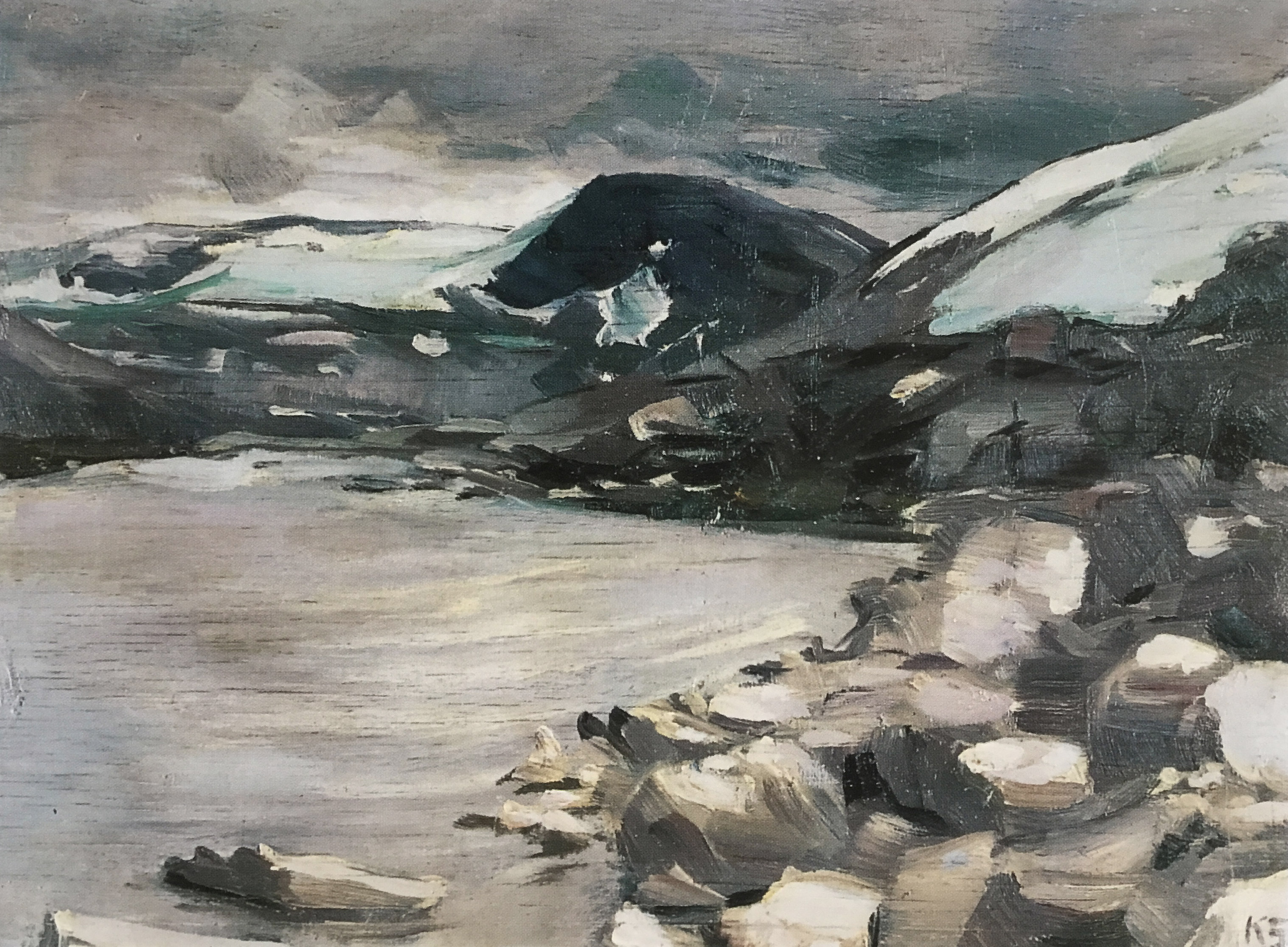
Grasdal ved Geiranger (The green valley of Geiranger), Norway 1936. Kurt Schwitters lived for several years in Norway and has had a major influence on many of today's artists. The Henie Onstad Art Centre in Bærum exhibits the largest permanent presentation of Schwitters outside Germany; highlighting his close ties to Norway. These paintings are difficult to reconcile with the avant-garde works with which Schwitters renewed art. The young Danish artist Per Kirkeby, who started collecting the paintings in the 1960s, called the landscapes “forbidden paintings — works that do not fit in with history”.
Schwitters’ work lives on. In addition to his visual art, he left experimental stories, poems, and plays, including his famous poem An Anna Blume (commonly translated as To Eve Blossom), which first attracted an international audience in 1919 for its originality and inventiveness, and various sound experiments including a 40 minute “primeval” sonata, Ursonate, and which is still performed today.
Schwitters used his art to enact his motto: “Create connections, if possible, between everything in the world.” He epitomized the avant-garde in his day, and continues to do so.
All images courtesy of the artist.
Related stories in Woodland Magazine:
Sources: