PUBLIC ART. WHY NOT?
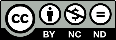
Gordon Young is a British visual artist who focuses on creating art for the public domain, often including typographical elements. His work ranges from sculptures to typographic pavements. The common denominator for all projects is the basis of relevance to the surroundings. Gordon has a collaborative approach to working and has built up over the years strong and fruitful relationships with a diverse range of people from architects, landscape architects, graphic designers and engineers to foresters, cyclists, librarians, climbers, ornithologists, historians and code breakers. In collaboration with Why Not Associates, Gordon Young created Comedy Carpet as part of the major regeneration of the promenade at Blackpool. His most ambitious project to date covers around 2200m² — made of 300 slabs of granite — making it one of the largest and most complex pieces of public art ever commissioned in the UK.
In 2010 I was researching ideas for a course on typography when I came across the Typographic Trees of Gordon Young. I was immediately drawn to the combination of creating of a work of art in the environment and the integration of letters and typography. Since then I have started following his work.
Gordon Young is one of the UK’s leading artists in creating art for the public domain. I've read in an interview Young was always interested in things he’d come across in the environment like wonderful neolithic sites, the Roman Wall and in Carlisle castle ‘the saddest stone in England’. It fascinates him how people had shaped places and made them special for all different kinds of purposes. Young had an art education and at a certain time sculpture seemed a suitable vehicle to do things and engage with a wider audience.
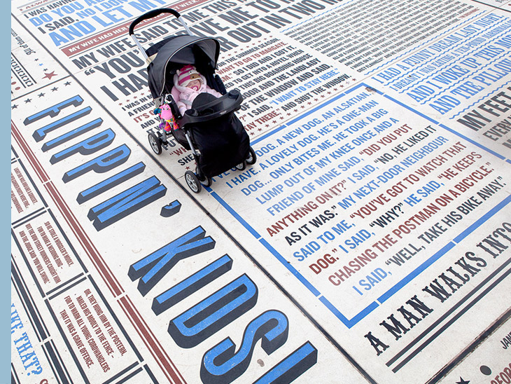
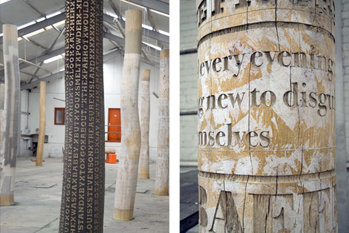
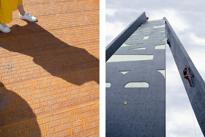
With over 20 years experience he has created projects as diverse as a forest of typographic trees in Crawley Library, a series of 20m sculptural/climbing walls in Blackpool, The 7 Stanes in Scotland, and a Walk of Art in Yorkshire Sculpture Park. For this fund-raising project Young made a pathway 110 meters long carved with the names of all the donors to the park.
"Public art is not only about ideas and concepts, it is also about delivering on time, in budget and of the highest quality. The limitations are the budget and time and the faith and trust of the client." — Gordon Young
Another project in Ayr featured words by Robert Burns, a Scottish poet and lyricist, carved into the steps in front of a local pub. In other words, Young accomplishes his environmental pieces through several media, but always makes use of some form of type, some kind of written language.
For the Crawley Library project, Young has been etching literary quotations on fourteen green oak tree trunks that are placed around the area. Each trunk shows quotations selected specifically for the environment in which the trunks are located. Each quotation is etched in a font that suits the subject matter, the era, the author, etc. A Harry Potter quote comes in a 16th century font, while a Jane Austen quote comes in a feminine Joanna.
What then is the Comedy Carpet? It is made up of 160,000 sawn letters out of solid granite towards constructing a giant board-walk on the Blackpool water-front — like the Eric Morecambe memorial this includes jokes, catchphrases and punchlines etched in to it, but this time from a thousand British comedians. One of the most visible quotes ‘Nice to See You’ is very apt and was first used in the 1970’s by the recently knighted Bruce Forsyth on the BBC game-show The Generation Game. The Generation Game is now long gone but Bruce Forsyth is still very much with the Brits as is the catch-phrase.
His website does though provide fuller details of all his eye-catching projects.
"It's a completely insane thing to be doing, but having worked with the artist, Gordon Young, before – it's what we've come to expect" — Andy Altmann, Why Not Associates
Young is always concerned with making installment pieces that match and influence their own contexts. And that’s where Why Not Associates came in: as graphic designers that do everything from museum catalogs to Nike posters, they were Young's go-to team for the precise, sleek-looking fonts that suit his every purpose. Young met them in Hull many years ago, as they were doing the graphic’s for the art’s festival, and he was doing a fish pavement. Young knew and cared about stuff, scale issues of permanence, Why Not Associates knew about typography, technology and design but most importantly were open and intelligent, empathetic and respectful.
Why Not Associates was a British graphic design company with a global reach. For nearly 25 years, they have been creating innovative work in many different media, including corporate identity, digital design, motion graphics and television commercials direction, editorial design, environmental design, publishing, and public art.
Occasionally, while perusing Young and Why Not Associates' extensive work together, the obvious strikes you as suddenly fascinating: fonts and styles really do affect the way we receive the written word, and, in turn the environment on which they are imprinted. If you’re keeping your eye out — like I certainly am — for innovative and harmonious usage of type, these artists are definitely worth keeping tabs on.
Unrelated to the current coronavirus pandemic, unfortunately Andy Altmann and David Ellis are going their separate ways, closing down Why Not Associates after almost 33 years of work to pursue their own projects. So I can't provide you anymore with a link to their website. They will certainly be remembered for Comedy Carpet collab with Gordon Young or its deSingel in Antwerp rebrand. Read more...
All images courtesy of the artist. Photos © Gordon Young.
More story related stories:
Related stories in Woodland Magazine: